Checkout redesign
Overview
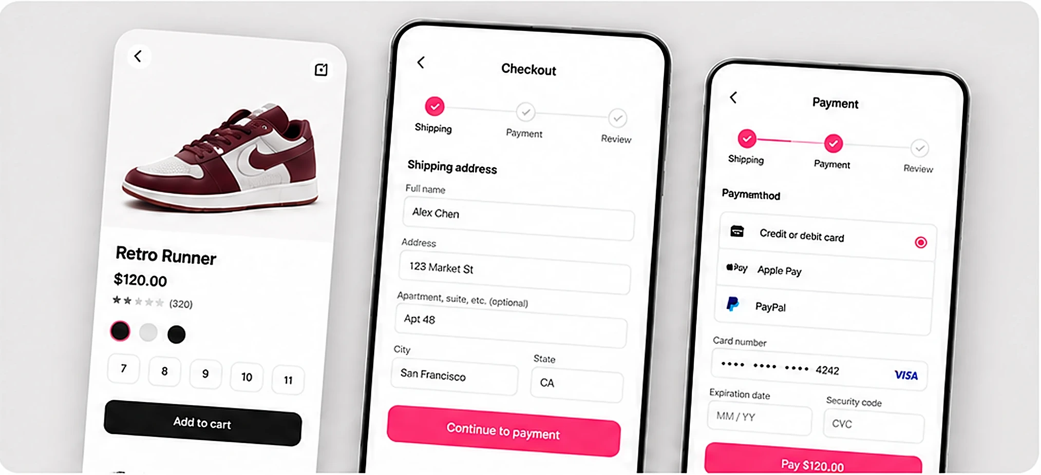
Stride’s mobile checkout took five screens and lost shoppers at payment. I led the redesign of the cart-to-payment flow — from research through launch. (Fictional sample project.)
Problem & user needs
Shoppers chose a size, then hesitated. - Shipping cost appeared only on the last screen - Size changes sent people back to the product page - Payment asked for details the app already had
Role, team & scope
Lead product designer with one PM and three engineers over eight weeks. I owned research, interaction design and the handoff spec.
Research & key insights
Eight interviews and a review of checkout session recordings. - People wanted the total before committing - Product photos reassured them at the cart - Saved cards were trusted when clearly labelled
Design decisions & tradeoffs
We moved the full total into the cart, kept a large product photo through every step, and collapsed payment to a single screen. The tradeoff was a denser cart; we kept size and quantity editable in place.
Final solution
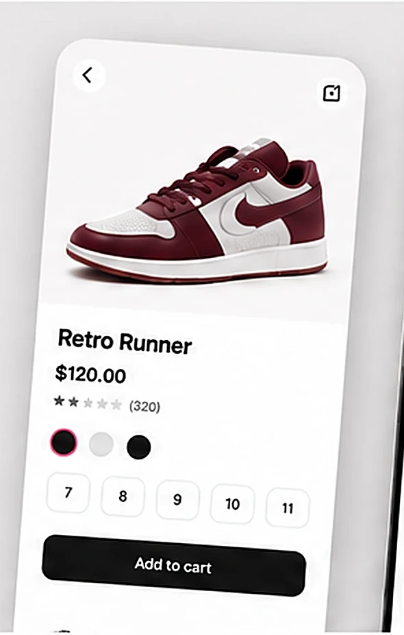
Three screens: product, cart with the full total, and one-step payment with saved cards.
Outcomes
In this sample story, checkout went from five screens to three and the total was visible before payment. Figures here are illustrative, not real results.
Reflections
Next time I would test the denser cart earlier with returning shoppers.